For those of you who've been to my classes or week-end courses and we've talked about "finishing", particularly manding, there is a wonderful video about linen that show's checking and mending linen fabric beautifully. You all have all had a go at checking and mending your fabrics, but this is on a grand scale!
The video is only about 15minutes long, but is well worth watching and you will see the checking and mending about half way through.
http://vimeo.com/16474921
Linen is a really beautiful fabric and is now being mixed, again, with other fibres, including cashmere. Mm... gorgeous!

Thursday, November 11, 2010

Sunday, November 07, 2010
Sett - Part 2
At the beginning of last month I posted about Sett. It's something that's really important to grasp as a new weaver and getting it right comes with practice. At a workshop with a group of newish weavers we had a really good look at Sett and here are the results:
 With a 12" rigid heddle loom (Ashford Knitters Loom) we warped with 32 ends (threads) of J. C. Rennie's lovely Supersoft Lambswool (2/6's). Each of us had a different rigid heddle; 5 dent per inch (dpi), 7.5 dpi, 10 dpi and 12 dpi; so each warp was a different width, as you can see below:
 In the 5 dpi reed, the 32 end warp was 6" wide and ensuring a balance weave - equal numbers of warp ends to weft picks - 32 picks (threads in the weft) were woven to 6" in length. This was made fairly easy by using a colour and weave pattern in the warp and weft.
On the right the woven swatch has been "finished", that is, crabbed (using a dry cloth with steam iron or a damp cloth with a dry iron) then given a hand hot wash and hand hot rinse and allowed to dry naturally.
The very open weave swatch lost more than 1" all round after finishing! We could have finished more and still maintained the soft handle.

The swatch on the right, here, was woven on the 7.5dpi reed and the 32 ends were 4" wide. After finishing, as above, the resulting balance weave swatch was 3 1/2" wide, with a slightly firmer handle, suited to a masculine scarf.
 The small swatch on the left was woven on the 10 dpi reed and the 32 ends were 3" wide. After finishing, as above, the swatch was 2 3/4" all round, with a firm handle, suitable for a blanket.
 The 32 ends of this little swatch, were 2.5" in the warp and after finishing like all the previous swatches was 2 3/8" all round. To obtain the balance weave it had to be beaten very firmly and the resulting swatch would be suitable for upholstery fabric.
One outcome of this exercise was that we found it more difficult to maintain a balanced sett with the widely spaced warp than the close sett warp. However, once crabbed and washed the resulting swatch looked fine!
I do hope this was useful, please let me know if you have had similar results.
 With a 12" rigid heddle loom (Ashford Knitters Loom) we warped with 32 ends (threads) of J. C. Rennie's lovely Supersoft Lambswool (2/6's). Each of us had a different rigid heddle; 5 dent per inch (dpi), 7.5 dpi, 10 dpi and 12 dpi; so each warp was a different width, as you can see below:
On the right the woven swatch has been "finished", that is, crabbed (using a dry cloth with steam iron or a damp cloth with a dry iron) then given a hand hot wash and hand hot rinse and allowed to dry naturally.
The very open weave swatch lost more than 1" all round after finishing! We could have finished more and still maintained the soft handle.

The swatch on the right, here, was woven on the 7.5dpi reed and the 32 ends were 4" wide. After finishing, as above, the resulting balance weave swatch was 3 1/2" wide, with a slightly firmer handle, suited to a masculine scarf.


One outcome of this exercise was that we found it more difficult to maintain a balanced sett with the widely spaced warp than the close sett warp. However, once crabbed and washed the resulting swatch looked fine!
I do hope this was useful, please let me know if you have had similar results.
Friday, October 29, 2010
Colour Palette of the Month - November!

At the beginning of October I had a lovely week-end in London. On the Saturday I wanted to go to the Tate Modern to see the Gaugan Exhibition and decided to walk along part of the Embankment to the Millenium Bridge.
Along the way I came across quite a few juxtapositions of old buildings and new buildings as you can see on the left. This particular one really caught my eye with the "all glass" building that takes on an indigo colour in the background and the beautiful old building, with it's sand coloured brick and detailing stone work.
How lovely this colour palette would be in natural dyes and weave! From the top I'd use indigo with an iron modification; indigo on it's own, but dipped several times to build up the deep blue; a very light, quick dip in indigo with a very quick and light modification with iron to get the blue grey; Oak Gall modified with citric acid; cutch.
Mm..... This has really got me thinking! What about you, what would you use?
Monday, October 25, 2010
Workshop 2 at Flitwick
I had a great week-end in Flitwick with the rigid heddle weavers from UK Weavers on Ravelry. I showed them Colour and Weave and even though some of them used some unusual yarns (to weaving) they still managed to produce some wonderful colour and weave patterns.
I showed them how to design their own Colour and Weave patterns to make their plain weave (tabby) truly exciting. Take a look at just a few of the many patterns they designed and explored themselves, before warping their looms for a second time to weave an article of their choice in their own pattern!

Here's an interesting pattern using less blue than red and repeating the warp pattern in the weft.

This pretty design was originally in red and white but then the occasional green end was added the weaver decided to add green weft picks.

This weaver chose the lovely lilac and white with a wide colour and weave pattern and in her last swatch chose the odd dark blue end to lift the effect.
 This pattern, like the others, was designed on paper before the loom was warped, so the weaver worked out the interesting line and dot pattern in advance.
 This weavers was disappointed in her pattern, until we "finished" it! Despite her yarn choice ("for practice purposes"!) she wove a really lovely pattern that this image doesn't do justice. Her first choice of black and white was lifted with quite an electric green.
This was a really good example of how important "finishing" is as part of the weaving process!
 Orange and grey lambswool was used by this weaver for all her beautiful colour and weave designs, before she added the brick red colour to add impact.
For her main project, she chose the same pattern, but with a golden yellow and grey with the brick red accent.


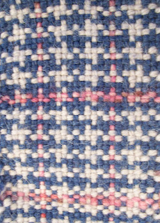
I showed them how to design their own Colour and Weave patterns to make their plain weave (tabby) truly exciting. Take a look at just a few of the many patterns they designed and explored themselves, before warping their looms for a second time to weave an article of their choice in their own pattern!

Here's an interesting pattern using less blue than red and repeating the warp pattern in the weft.

This pretty design was originally in red and white but then the occasional green end was added the weaver decided to add green weft picks.

This weaver chose the lovely lilac and white with a wide colour and weave pattern and in her last swatch chose the odd dark blue end to lift the effect.


This was a really good example of how important "finishing" is as part of the weaving process!

For her main project, she chose the same pattern, but with a golden yellow and grey with the brick red accent.

Although this weaver chose an acrylic yarn for her samples, she still produced a beautiful set of colour and weave designs, as you can see here, clearly shown in dark brown and white.

This interesting swatch used wool with a cotton effect yarn in the main swatches with a black effect yarn as an accent in one of her last swatches. With careful "finishing" she prevented too much shrinkage of the wool, but wants to go on to explore the effect of shrinkage on yarns of differing fibre content.

Cotton was the choice her for this simple, but effective use of two shades of blue. Later swatches used white to lift the whole effect. It was really stunning.
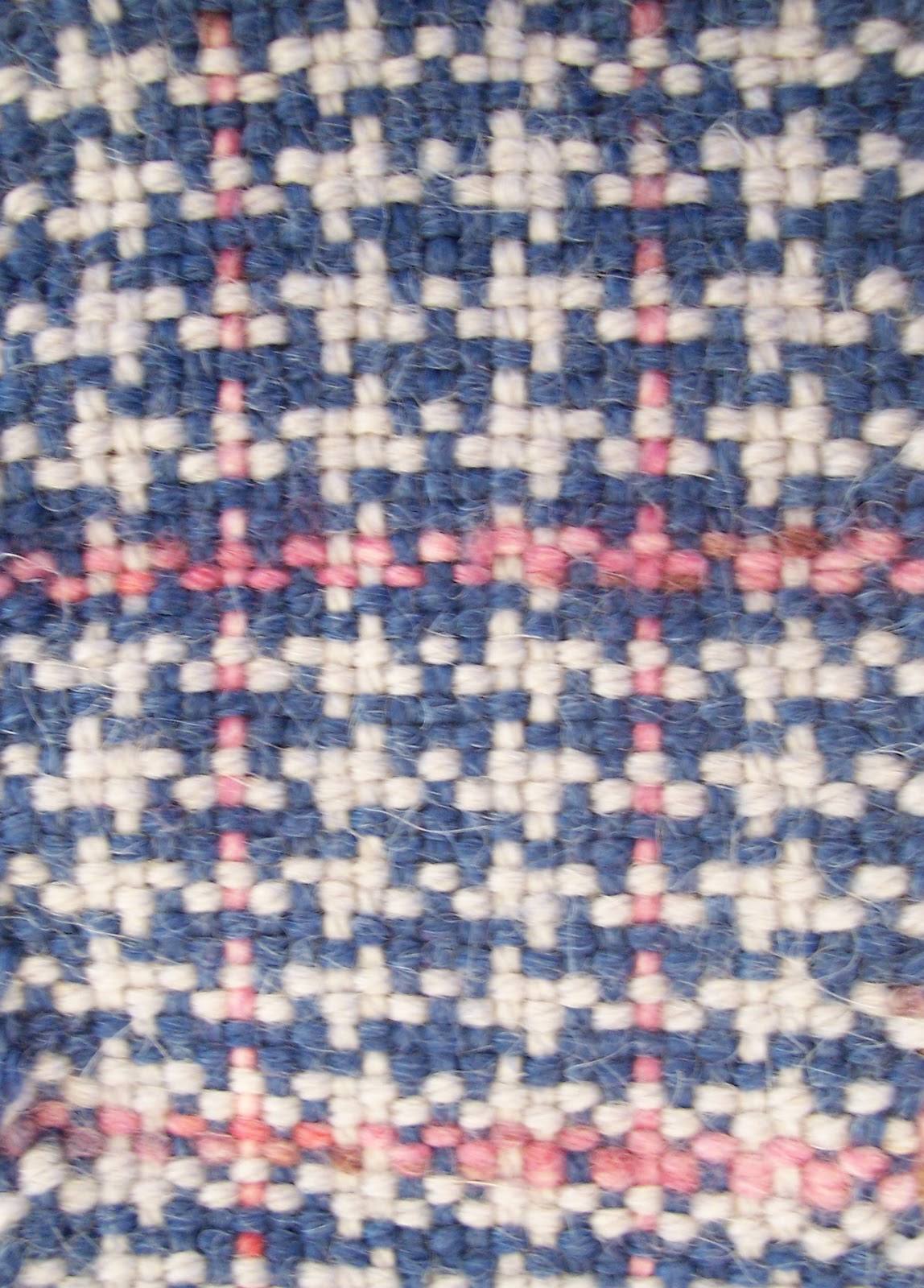
Another very simple, but beautifully effective colour and weave pattern which was lifted by the injection of the soft peach yarn.
Well done to everyone who took part in the workshop, you worked hard over the week-end and were all very receptive to all my instructions and have a range of swatches for future use.
Oh, and a huge thank you to Jan for organising it and making my job so enjoyable!
Colour and Weave Design: A Practical Reference Book
Oh, and a huge thank you to Jan for organising it and making my job so enjoyable!
Colour and Weave Design: A Practical Reference Book
Friday, October 22, 2010
My Brand New Website
I'm so excited, my new re-designed website has just gone live. I'm really pleased with it, the design is so clean and fresh and now incorporates my blog, so I don't need the old Wordpress blog. I've added an e-commerce shop so I can sell some of my products.
So with out further ado.................. Ta Da
Please let me know what you think!
So with out further ado.................. Ta Da
Please let me know what you think!
Tuesday, October 12, 2010
And the Winner is............
As some of you will know I was shortlisted for Best Fabric Collection at the Northern Design Awards, 2010. The other shortlisted companies were:

Best Fabric CollectionDesign Awards. The other shortlisted companies were:
- Gallery 22 for their Need’k fabric collection
- Montgomery for their Esquire collection
- James Hare Silks
We had a great night at the Grosvenor Hotel and Spa in Chester on Friday evening, starting with a champagne reception at 7pm, a wonderful meal from the Michelin Stared chef and the Awards Ceremony hosted by Nick Knowles of DIY SOS!
There were some wonderful winners in all the categories not least the Best Fabric Collection which was won by…..
Gallery 22 for their Need’k collection!
I’d like to congratulate Gallery 22 for being farsighted and retailing Need’k's wonderfully innovative collections.
I feel truly honoured to have been shortlisted with such wonderful manufacturing companies, since I am a designer maker hand weaving bespoke fabrics for my clients in my studio at home. Needless to say, my designs are woven for my clients with just as much care, consideration and passion as the manufacturers and would like to feel that I provide a very high level of customer care, too.
Take a look at my shortlisted collection and if you are interested in my textiles you might like to look at my website, Alison Yule Textiles. Please keep looking at my website over the next few weeks, it’s being radically updated and will have a small retail area where you will be able to by some one off pieces.
Friday, October 08, 2010
Sett

I've been asked how to work out whether a yarn is suitable for weaving on a rigid heddle loom and have been trying to explain about wraps to the inch. I decided it was much better to do this via this blog!
On the right is an image of a yarn wrapped round a stick (this could be a pencil or pen or even straight round the ruler!). You should see that it's been loosely wound so that the yarn isn't stretched, which would make the yarn narrower and give a false number of wraps. There are 14 wraps to the inch with this yarn.

That would make 7 warps and 7 wefts = 14 wraps.
Therefore with 7 warps (S) we could use a 7.5 epi reed, the nearest in number to our yarn.
If a very open and softly draping shawl was being made we could go for a 5 dent reed or if we wanted firm upholstery fabric we might use a 10 dent reed. We work this out by taking the wraps number, in this case 14, and divide it by 2 to get the sett for a balanced plain weave, 7 (S) here. To allow for extra drape we can decrease that number by 5 - 10%, here that would be 0.7 at 10% which is approx. 1 end. Take this from 7 (S) to give 6 ends, and you will see that the nearest reed is the 5 dent reed.
If you are using a slippery yarn to make a scarf, decrease S by 5% for drape but increase by 20% for slipperiness, a net increase of 15%.
For upholstery fabric increase S by 15 - 20% and beat very hard to obtain a balanced cloth.
I hope this helps!
Tuesday, October 05, 2010
Colour Palette of the Month - October

Last month I took my daughter to University in Aberdeen, while there we visited the Winter Gardens, a series of Victorian glass houses in Duthie Park south of the city.
I love anthuriums, they are a recurring theme in my work. They are such strong flowers, strong in form, shape and colour and are the inspiration for this months colour palette. I worked on this palette when we got back from Aberdeen and just before we went to exhibit at 100% Design. By coincidence one of the strong colours at the show was magenta!
I hope you enjoy this palette with or without the green I’ve added as a contrast.
Wednesday, September 29, 2010
100% Design 2010
Here are a few images of my stand at 100% Design 2010, held at Earls Court in London.

This images shows my chaise-longue, designed by Darren Kelly of Staffordshire University, a throw and bolster cushion.

This shows the close up of the detail on the back of the chaise-longue.

This is the shelving unit, Darren designed to take a woven panel of the same fabric as the throw.

Here is another view of the stand. The colour on the walls is a better match in this image.

Here is the screen that Darren designed to take my woven panels. I can remove the panels and replace with another design for other shows.

This images shows my chaise-longue, designed by Darren Kelly of Staffordshire University, a throw and bolster cushion.

This shows the close up of the detail on the back of the chaise-longue.

This is the shelving unit, Darren designed to take a woven panel of the same fabric as the throw.

Here is another view of the stand. The colour on the walls is a better match in this image.

Here is the screen that Darren designed to take my woven panels. I can remove the panels and replace with another design for other shows.
Sunday, September 19, 2010
Shortlisted for Northern Design Awards!
I've been shortlisted for Best Fabric Collection in the Northern Design Awards where Concept For Living magazine will bring together designers, retailers and property developers in a glittering celebration of the best in northern design, architecture and craftsmanship.
I'm delighted to have the opportunity to display my unique hand-woven products again, which include wall panels, cushions and window hangings in wool and linen. Every single piece is hand woven using richly textured techniques with simple, effective designs and hope they will catch the eye of judges at the event, which will be held at Grosvenor Hotel and Spa, Chester, on Friday 8 October, 2010
Tuesday, September 14, 2010
Colour Palette of the Month - September

While scrambling over a wall I spotted the lichen on one of the stones and as it was so gloomy and wet it was the gold that stood out. Isn't strange how colour really pops out at you when it's dull, but on a bright day it can appear quite washed out!
So here's my colour palette for September, neutral greys and taupes with a bright zing of gold and fresh green.
Enjoy!
Saturday, August 07, 2010
Colours of Kinder Scout!
 Last Sunday, as our tribute to National Parks week, we walked from Barber Booth and up onto Kinder Scout, the highest point in the Peak District National Park, in Derbyshire.
It was a dry day, mostly, but up on Kinder we felt very close to the lowering clouds. I'd never been up on top and was very saddened by the terrible erosion, but amazed by the rock formations and lovely muted colours.
Here is one of the wonderful rock formations that inspired me to produce this colour palette!
Thursday, July 29, 2010
More Bamboo Bad News!
Following the previous post about bamboo, I've been alerted to another website that has information on the processing of bamboo into fibre and ultimately into fabric:
http://green.wikia.com/wiki/Bamboo:_An_Eco-Friendly_Fabric%3F
Don't be confused by the advert for Honda at the top of the article! It's well worth a read and gives an really good insight into the "horrors" of bamboo that I had hope wouldn't come true, but sadly has.
http://green.wikia.com/wiki/Bamboo:_An_Eco-Friendly_Fabric%3F
Don't be confused by the advert for Honda at the top of the article! It's well worth a read and gives an really good insight into the "horrors" of bamboo that I had hope wouldn't come true, but sadly has.
Wednesday, July 21, 2010
Anglesey Inspirations 2

This first one takes the colours from the heathland at South Stacks on Holy Island. The low growing heather and gorse were like a beautiful carpet of fresh greens, yellow and pinks.

"Colours of the Earth" takes it's inspiration from Parys Mountain, the copper mine near Amlwch on the north of Anglesey.
These earthy mineral colours reflect the range of ore that has been mined here for thousands of years and present a very warm palette.

Finally, our last morning on the beach at Aberffraw was the inspiration for this colour selection.
The contrast of the warm sand colours and the cool blues give a very fresh palette.
Anglesey Inspirations

We've just got back from a couple of days away. We went to Anglesey where we visited South Stacks on Holy Island, Parys Mountain, which at one time was the larges copper mine in the world, and Aberffraw.

Although it was quite dull on the first day, the colours were really inspirational. At South Stacks the heathland colours were lovely pink purples, yellows and greens of the heather and gorse, while at Parys Mountain the colours were of mineral blues, ochres, browns and pinks.

Today the sun shone and we were treated to the beautiful blues from the sea and the sky and soft sand colours from the beach.
The three images I've selected give you a flavour of the rich colours and textures we saw!
Wednesday, July 14, 2010
Just How Eco Friendly is Bamboo?
Just how eco friendly is bamboo, well there is a really good article on Ecouterre which explains the viscosing process of bamboo in nice simple terms. Check it out!
Ever since Jane and I wrote Creative Spinning, we realised that most of these new "eco friendly" fibres, really are not friendly to the environment at all. I've even turned down the chance of a commission to design bamboo fabric for a mail order company who were specialising in bamboo products, I felt so strongly about it!
The claim by the manufacturers that bamboo is the only anti bacterial fibre is really not true, wool also has these properties and for area's that have sheep it is the only sustainable fibre. Here in the UK wool now has a champion in Prince Charles. I'm not a monarchist, but I do applaude his sentiments and if it takes his forthright views to get people to sit up and take note then I'm with him 100%!
Ever since Jane and I wrote Creative Spinning, we realised that most of these new "eco friendly" fibres, really are not friendly to the environment at all. I've even turned down the chance of a commission to design bamboo fabric for a mail order company who were specialising in bamboo products, I felt so strongly about it!
The claim by the manufacturers that bamboo is the only anti bacterial fibre is really not true, wool also has these properties and for area's that have sheep it is the only sustainable fibre. Here in the UK wool now has a champion in Prince Charles. I'm not a monarchist, but I do applaude his sentiments and if it takes his forthright views to get people to sit up and take note then I'm with him 100%!
Yarn Maker
I'm very please to have been asked to write a series of articles by Dot Lumb, of "Dots Fibre to Fabric" Blog, for her new Magazine, Yarnmaker.
This is a huge venture for Dot, but one that should be really exciting. I know Dot has been working very hard on this for over 6 months, now, and I hope that you will all support her by buying the magazine, which is about to be launched. It's about time we had a UK based magazine for spinners, as good as Spin Off is, it's quite frustrating for every one in this country and Europe when we want to buy any of the fibres or fleece mentioned in articles only to find they are from the States.
You can download an order form from the Yarnmaker website for a single copy or a subscription and read all about the first issue on Dot's blog.
This is a huge venture for Dot, but one that should be really exciting. I know Dot has been working very hard on this for over 6 months, now, and I hope that you will all support her by buying the magazine, which is about to be launched. It's about time we had a UK based magazine for spinners, as good as Spin Off is, it's quite frustrating for every one in this country and Europe when we want to buy any of the fibres or fleece mentioned in articles only to find they are from the States.
You can download an order form from the Yarnmaker website for a single copy or a subscription and read all about the first issue on Dot's blog.
Wednesday, June 30, 2010
Basic Akha Spindling
Hi
I'm just back from Woolfest where I was selling our Pure Tinctoria range of natural dye extracts. While there I did some basic spinning teaching for customers of Michael Williams. As a thank you he gave me the pick of any of his spindle! Wow, I chose his lovely Ahka for spinning fine short fibres, such as cotton or guanaco. Here is a video I found of Amelia Garripolli spinning on her Ahka.
Saturday, June 19, 2010
Knockando Woolmill - Speyside, Scotland
This gem was on a BBC programme, a couple of years ago, I think. Does anyone know what's happened to the project?
Sunday, June 13, 2010
New Diz from Michael Williams
A couple of weeks ago a got a new diz from Michael Williams. I wanted a diz for my hackle and had asked Michael to make me on that was small, but still be able to have three holes of different sizes.
Here are the results of my trials:

I loaded my hackle with a layer of red tops from the Ashford Corridale range.

Then onto this I put a layer of blue and white Corridale, about 1/2 and 1/2.

This was followed by a top layer of red Corridale, giving me a sandwich of red, white and blue.

Taking the new diz, I began to pull the tops, working from right to left, then left to right and so on.
I started by using the small hope first, then after reloading the hackle I used the large hole to pull the tops. After another identical reload of the hackle I finally used the medium hole to pull the tops.
 The diz felt very nice in my hand, was much less fiddly than the rectangular button I'd been previously using and, surprisingly, I was able to pull all the long fibres only leaving the short noil fibres which was much better than with the button.
You can see the pulled tops on the left. From left to right - tops pulled through the small hole, large hole, medium hole.
At the front is the new diz from Michael Williams and the threading loop with lovely turned wood handle.
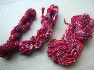
I spindle spun all three trials on my Michael Williams top whorl spindle.
Although there looks very little difference between the three spun yarns, the one on the left, pulled through the small hole, is much more blended. The centre yarn has more definition between the colours and was pulled through the large hole, while the right hand yarn, my favourite has a good balance of the colours, being pulled through the medium hole.
I understand that Michael will be selling these new diz at Woolfest, at Cockermouth, in Cumbria, on Friday and Saturday, 25 and 26 June 2010.
Here are the results of my trials:

I loaded my hackle with a layer of red tops from the Ashford Corridale range.

Then onto this I put a layer of blue and white Corridale, about 1/2 and 1/2.

This was followed by a top layer of red Corridale, giving me a sandwich of red, white and blue.

Taking the new diz, I began to pull the tops, working from right to left, then left to right and so on.
I started by using the small hope first, then after reloading the hackle I used the large hole to pull the tops. After another identical reload of the hackle I finally used the medium hole to pull the tops.

You can see the pulled tops on the left. From left to right - tops pulled through the small hole, large hole, medium hole.
At the front is the new diz from Michael Williams and the threading loop with lovely turned wood handle.

I spindle spun all three trials on my Michael Williams top whorl spindle.
Although there looks very little difference between the three spun yarns, the one on the left, pulled through the small hole, is much more blended. The centre yarn has more definition between the colours and was pulled through the large hole, while the right hand yarn, my favourite has a good balance of the colours, being pulled through the medium hole.
I understand that Michael will be selling these new diz at Woolfest, at Cockermouth, in Cumbria, on Friday and Saturday, 25 and 26 June 2010.
Subscribe to:
Posts (Atom)
