Showing posts with label colour. Show all posts

Sunday, November 08, 2020

New Directions - Part 2 - More of the Design Process.

 I love the design process and can no longer start a project without doing some sort of design, so I was thrilled when I heard that the UK Complex Weavers Group had arranged a design workshop with Laura Thomas.

In the last post I introduced the first steps Laura lead us through and here, in this post, I’ll show you my next steps.


Looking at the images on my mood board the next thing to do was to explore colour, so using my favourite medium of watercolour I looked at stripes in the colours found in the images.  The first stripes are rarely the best so it’s well worth the time taken to paint as many as you can, in your favourite medium until you feel the colours are right, not necessarily exact.


The next obvious think to look at is texture and it was while practicing marks using different tools and studying my images that I realised that the embroidery on the coat was herringbone.  


Using colour and texture and the herringbone idea I then tried out different ways to represent the idea.  

So many people ask me why it worth doing these exercises, but it’s doing them that helps to distill the ideas and I realised that herringbone was definitely the main structure I want to explore for this project and use two different shades of dark blue, one in the warp and one in the weft.


In the next post I’ll be explaining where the design process took me, but in the mean time, sign up for Laura’s newsletter as she will be running this course in the future.

Sunday, November 01, 2020

New Directions - Part 1 - Design

Now I’ve not been teaching since lockdown in March, I’ve been in need of new inspiration, although I’ve suffered, like a lot of creative folk, from a lack of motivation.  On the last two Saturdays of October I was lucky to take part in a Laura Thomas workshop, Design for Weave, organised by the UK Complex Weavers group.  It should have taken place in March in London, but Covid-19 put pay to that, however, Laura and Complex Weavers re-organised it to be online instead.

Those who know me recognise my love of design and it’s great value in producing good quality and stunning textiles, so will wonder why I would need or want another Design Course...  ...I’ve been doing a lot of simple woven structures for quite a while  now,  most of my students had rigid heddle looms, so any inspiration for them had to be with one, too.  So Laura’s workshop is timely as I’m in great need of a kick up the proverbial back side to get me looking at 8 shaft structures.

Laura gave us a starting point and lead us through briefs, the design process and beyond via her new Weave School.  


I’d never thought of mind mapping as part of my design process, but I found it really useful and will certainly do it again.

What came out the this was looking at colour contrasts.


I always start my design process with writing, usually it’s a discussion with myself about my inspiration, describing the colours, shapes, textures, etc., in my inspiration.  This time, though, it was a lead in from my mind map and began to distill my thoughts about colour and how I could use them in my fabric ideas and taking them forward to a mood board.


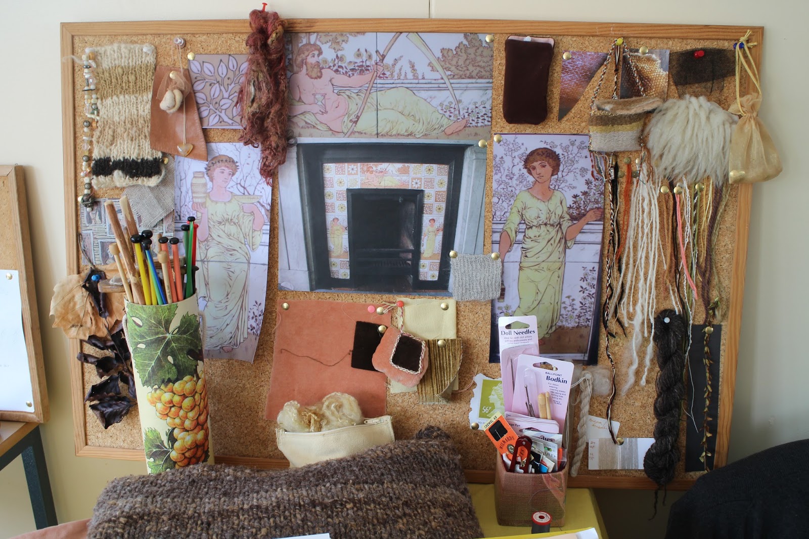
Mood boards are one of my favourite things about design, they help to distill my ideas and are a great way to present the mind map in a textile form and if you work commercially they give the client an idea of your interpretation of their brief.  These are always ‘movable feasts’, you may discover something, during the design process, that you’d not initially thought about, or the client my prefer some alterations.


I’ll talk more about my design process resulting from Laura’s workshop and where it leads me in more posts, but for now there is a lot of food for thought here.

Tuesday, March 07, 2017

Pantone's Top 10 Colours for Spring 2017

I recently posted my Colour Palette for March with 5 lovely colours and while browsing the "net" earlier today I spotted a post on Design Taxi about Pantone's top 10 colours for Spring 2017 and noted some similarities to my colour palette!


The Pantone colours 13-0755, 14-1315, 17-4123 and 19-4045 are the ones I think are particularly close to my chosen colours.  Two of the other colours, 17-4123 and  18-0107 are close to two of my chosen colours for February 2017's Colour Palette, what do you think?

Sunday, March 05, 2017

Colour Palette of the Month - March 2017

We are just five days into the Month and Spring is beginning to show in my garden with a few miniature daffodils and the last of my snowdrops.  There is a little warmth in the sun when it does shine, so I'm going to continue this cheer with my Palette of the month.
This photograph was taken a few years ago in the evening and the light gave the blue background which I love against the pale yellow of the flowers.  It would make some lovely striped fabric or an unusual and interesting tweed.
I used a quick Stripe Generator to produce the following pattern.  The colours aren't strictly true, but it gives you a good idea of what can be produced.

With the tweed design I wanted something a little different, not true checks or diagonal stripes, but a bit more broken.

I hope you like the ideas I've developed and I'd like to hear if you've had a go at reproducing your own designs or even these.

Monday, February 06, 2017

Colour Palette of the Month - February 2017

I felt it was about time that I re-instated the Colour Palette of the Month Series, so I'm kicking it off with February's palette.  This image is of Darrynane Beach in Kerry, Ireland.  It was a fabulously sunny day and I had to shoot into the sun to get this image, which was quite tricky.   I got the sparkle on the sea and the very strong shadows which in turn gave me the lovely smoky colours for this palette.

I hope you like this Palette, it's a good one for Colour Blending with fleece dyed in the basic colours of Red, Blue, Yellow, Black and White for a striped jumper, Fair Isle knitting or as a nice muted tweed fabric.  I'd love your feedback so leave a comment if you feel like it.

Alison

Tuesday, September 15, 2015

Design for the Terrified at AGWSD Summer School 2015

I was very lucky to be selected as a tutor at Summer School this year at Moreton Morrell, Warwickshire.  All tutors selected had been asked to write a blog post about the course or something related to the skills students would learn, to help prospective students decide if they should enrol on the course.  I wrote three posts,  which can be found here:
What is Design
Preparing to Design
Design Development

There were 12 students enrolled, 2 of which were attending for 2 1/2 days at the beginning of the week.  All were terrified when they arrived on Monday morning, but by Tuesday afternoon all were chatting and talking design amongst themselves, it was amazing to see the transformation!   I'd just guided them through a range of exercises, including colour studies, textural studies, collage, stripes, etc.  Everyone's approach to the design tasks were different as can be seen, here, in the images I took of their work on Saturday morning for their exhibition.


The two images above are from Anita's designs for a woven seat cover fabric inspired by the curtain fabric in the room the chair sits.  Anita stripe patterns resulted in a beautiful woven swatch that really worked with the curtains.  At the end she said she was no longer terrified!


 Ann's images, above, are inspired by shells in her collection.  She's a felt maker and her samples were stunning.  She is planning to make soft felt for fashion fabrics.  She had been quite sceptical, but began to really love doing the design work.  Ann, too, said she was no longer terrified!


Betty signed up late and could only get two half week courses and was persuaded to try Design for the Terrified at the beginning of the week and finish the week on Louise Martins Coptic Weaving course.  Betty sews and embroiders and was really worried that she'd be wasting her time, but said she was so, so glad she'd joined us and realised that design was the true beginning of the process of producing something.  Her plan was to design a hanging window treatment for her landing window that would be two sided, night on one side, day on the other.


These two images, above, are the work of Dunja who wanted to use the woollen yarn from her family farm in Wales.  Her inspiration was a beautiful image of a frosty tree with a bullfinch, it was a difficult picture that could be approached in a number of ways.  She isolated areas to produce a lovely stripe patterns and her mood board was a stunning example of how to do it.


The above two images are Elizabeth's work.  She's an experienced weaver who works in fine silk and her inspiration was one of the Shaun the Sheep figures in Bristol.   Her hard work lead to a range of swatches which she thinks she'd like to turn into fabric for a top and jacket.


Helena, a knitwear designer and spinner, chose a vibrant image of flamingo's as her inspiration.  She was looking for an image that represented a large part of her yarn stash and she succeeded!  She was inspired to spin extra yarn and try out some interesting knit ideas.


The three images, above, are of Linda's work.  She is a ceramicist, spinner and weaver, and already had design skills, but used the course as a refresher, her work was very colourful and resulted in some beautiful colour blended yarns.


Rachel's, a spinner and knitter, decided to use an antique fire surround in her home as her inspiration, which can be seen in the two images above.  Her plan is to develop a range of textiles to dress the room linking the flooring with the fire surround.

I only have one image of Rita's design work, above, sadly.  She came with a whirlpool image in black and white as inspiration which she developed into small tapestries testing out colour techniques.  She entered a beautiful little tapestry of a puffin flying to Orkney entitled "Approach to Orkney".  I fell in love with it, but it was at the end of the auction and I'd already committed to a couple of lots.  When I told her I was so sad it hadn't sold because I loved it, the whole group plotted to buy it from Rita to gift to me at the end of the course.  I was so touched I could have cried!  This is the image:


I think Shelagh might have been the most terrified of all of my students, not only about the course, but also about being my "Prefect" (all courses had an appointed Prefect to collect messages from Summer School office and help solve student problems).  She was the perfect Prefect, a great help to me and her fellow students!
Her plan was to design a fabric for a soft jacket in cotton and her inspiration was a beautiful field of wild flowers which, I understand, is still under development, but is getting very close to a lovely fabric.

This is Valeries work, sadly only the one image again, using a beautiful post card of lilies in very contemporary colours that had been the attraction.  As you can see she really took to the exercises to their limits and developed a range of blended handspun yarns in the exact colours.

I, too, enjoyed my time with the group, guiding them through the exercises.  At times it was a leap of faith on their part to do something that seemed irelevent to the inspiration and to what they had planned as the end result, but once they'd completed all the exercises they realised that all were needed in the process in any order and each triggered more ideas!


The whole group made friends with the on-site IT men and unknown to me they got a wonderful card made for me as a thank you.  And unknown to Shelagh they had a second made to thank her for her dedication as our Prefect!

Thank you, everyone, for being such excellent students and being a joy to teach.

Thursday, April 12, 2012

Deborah Allen - feltmaker


I want to introduce you to Deborah Allen, a very talented felt maker.

I met Deborah via the internet when she joined the Weavers-Spinners-UK group on Yahoo and last year she popped into the Pure Tinctoria stand at Wonderwool Wales to say hello.  She purchased the last of a lovely wool boucle yarn I was selling off because I couldn't get anymore.  At the time Deborah was going to crochet a jacket with this naturally dyed chunky wool yarn.

Deborah ended up unpicking the jacket, but has used it to great effect in some lovely Hundertwasser inspired wet felted bags that she's been developing. They are so beautiful, I couldn't resist showing them to you.

Her blog is full of wonderful felt inspiration and you can find her work for sale on Etsy.  If I had more time, I'd be back felting again!


Friday, January 13, 2012

Colour & Weave


Colour & Weave, a set on Flickr.
Four scarves in Colour & Weave hand woven on a rigid heddle loom (Knitters Loom) in JC Rennie 2/11.3nm wool and cashmere.

Wednesday, October 26, 2011

Sneak Peak 3

Here's my collage of the fungi I'm using for a tapestry workshop on Saturday.  Collage is a good way to introduce texture into your design process and starts to give you the feel of a textile.
With the colour and pencil textural studies you begin to feel closer to your design and ideas will now start to flow.

Friday, October 21, 2011

Sneak Peak 2

Not my usual style of painting, here, in oil pastel this time, but gave a better feel for the colours, still more work to do!

Beginning to get ideas for the tapestries and the woven shibori.  The tweed, well I love tweed, so that won't be too difficult, so more of that later.
Related Posts Plugin for WordPress, Blogger...